Karrot Athletic Leisure & Outdoor Wear
Athletic-leisure brand website. Focused on converting window shoppers into sure-fire purchasers by surfacing hidden products and info on an information-heavy site.
UX/UI Design | Branding
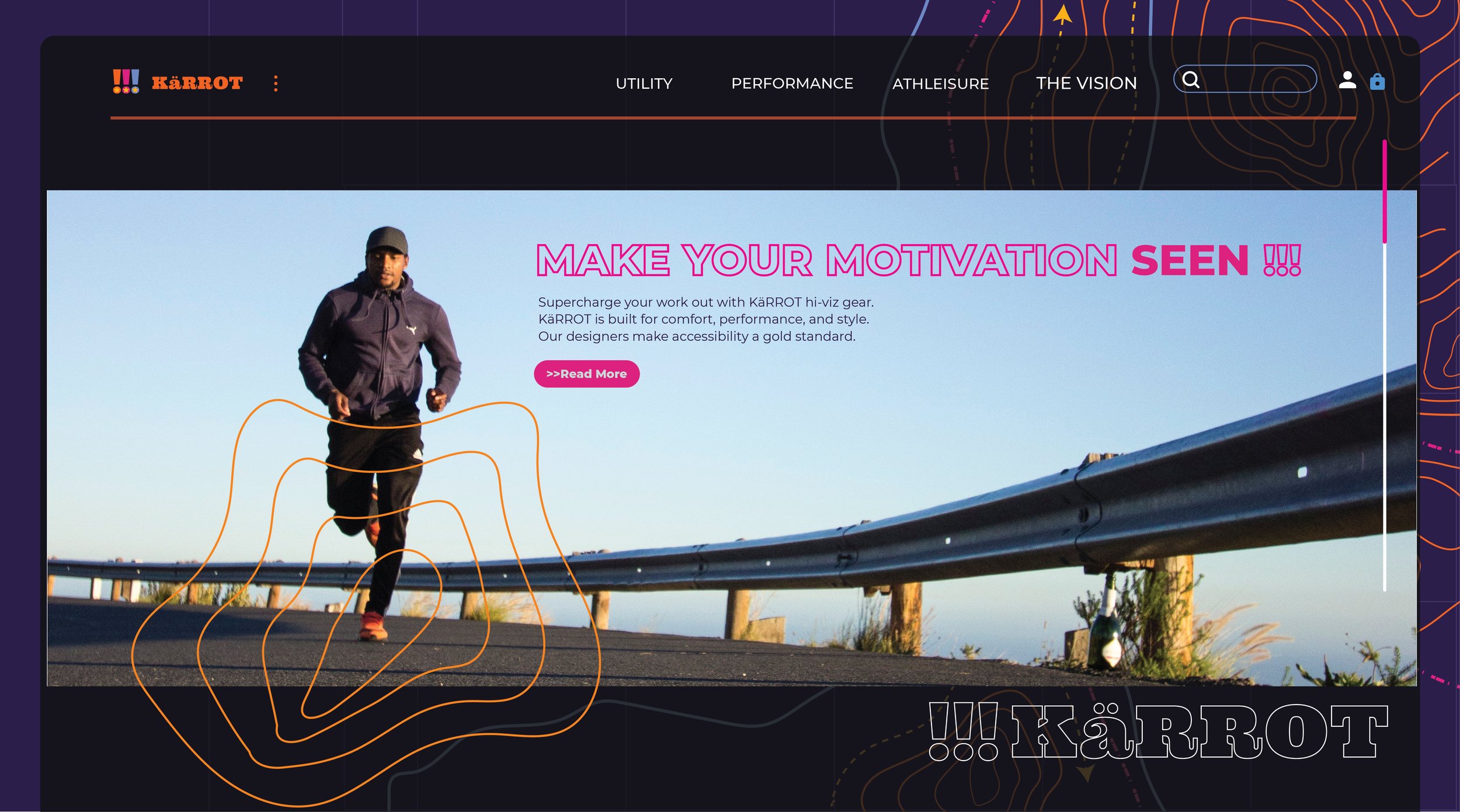
This conceptual project is a user experience design focused on creating an optimal sales funnel experience from start to finish for the customer. Features included surfacing information on products that help inform and guide consumer choice. Branding is focused on color accessibility and inclusion for Millennial audiences.
ROLES AND DURATION
This was a conceptual project where I was the sole designer. I focused on designing web & mobile versions of a website as well as a preliminary design system for the mobile version as well as the visual design/ branding. This project was worked on for over 3 months and involved tasks including sketching, user testing, user research, and usability testing with prototypes, visual interface design, wireframing, low fidelity prototyping, and high-fidelity screens. Tools included Adobe XD, Adobe Photoshop, Adobe Illustrator, and paper sketching.
THE PROBLEM
Brands have a growing problem of matching the needs of the largest growing spending demographic of Millenials (ages 25-35). In addition to navigating how to establish brand loyalty, the product ecosystem valued by Millenials eludes most brands fighting to discover what makes Millenials tick’. Design problems plaguing this purchasing ecosystem include unimportant functionality, difficulty comparing other products, low conversion, complicated architecture, bad navigation, and accessibility as pain points.
GOALS
Create an experience across mobile and web devices using effective UX/UI design.
Deliver conversation-focus design including product feature compatibility.
Develop preliminary design system and UI patterns emphasizing accessibility.
DESIGN PROCESS
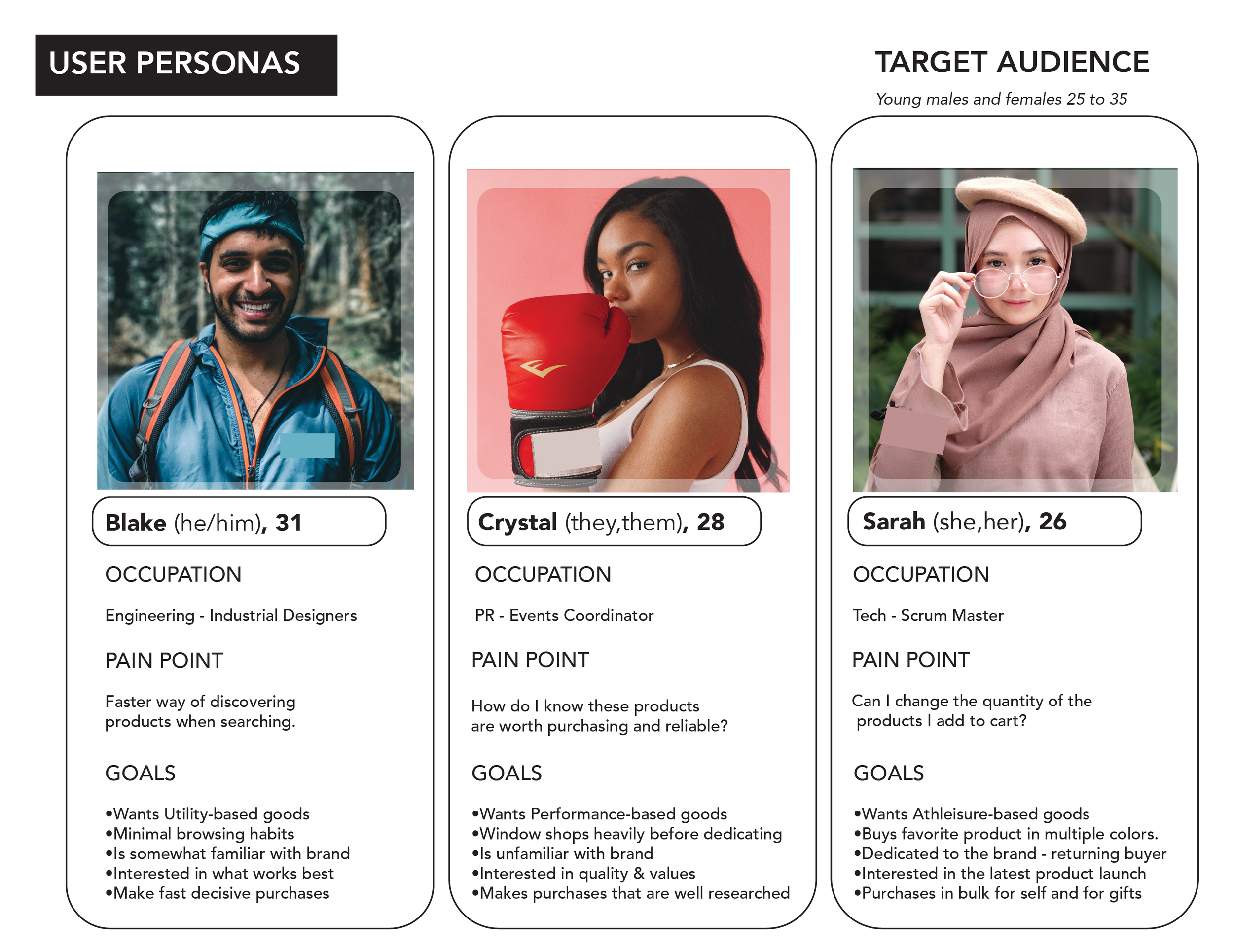
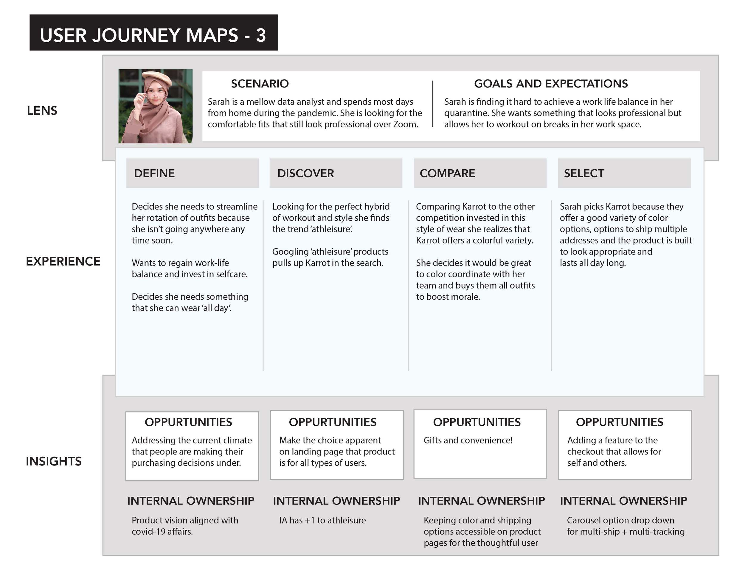
Personas: Through preliminary user research and marketing research to develop personas that reflect the key audience of Millenials that are the hardest to convert and how to design around their spending trends, habits, and behaviors best.
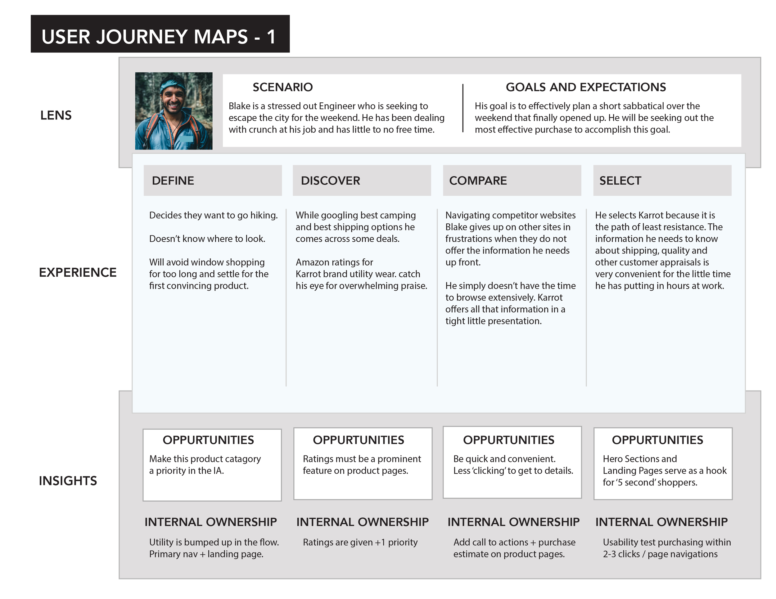
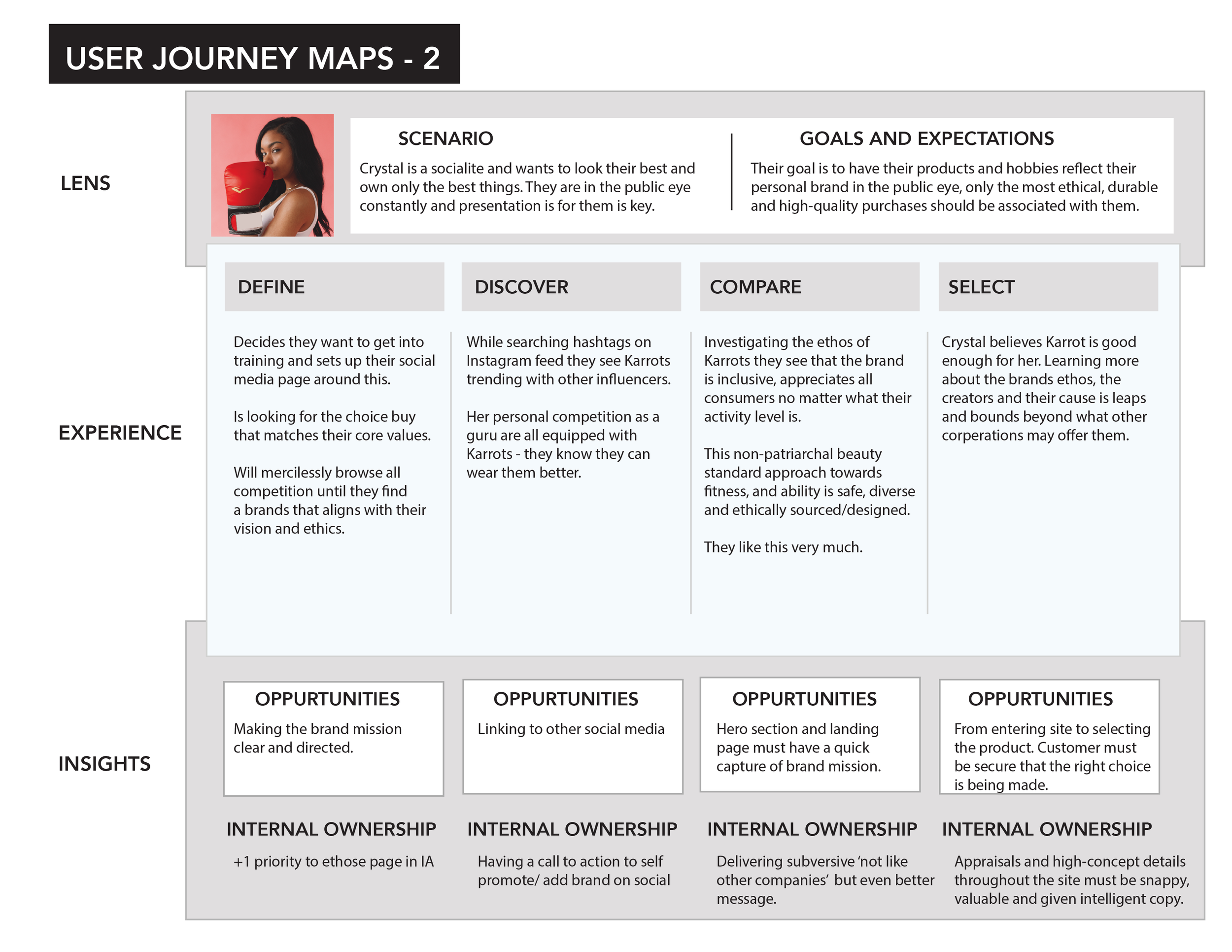
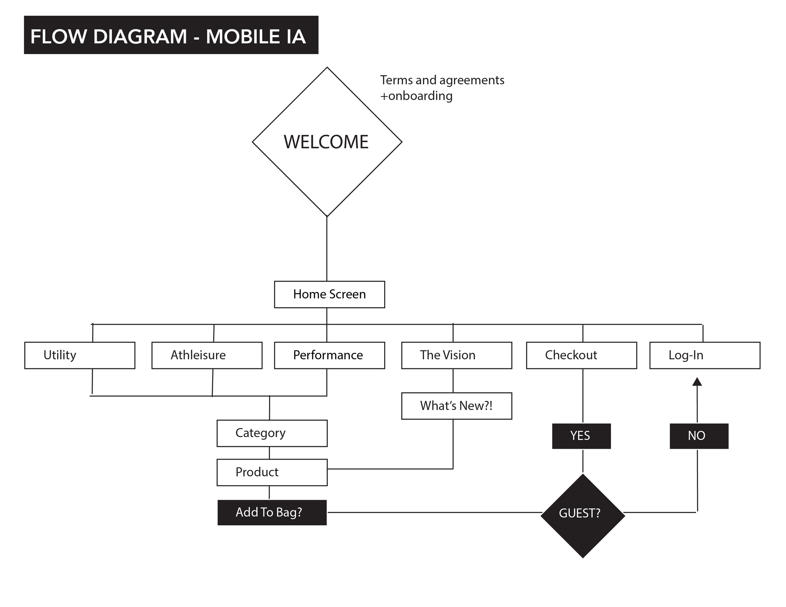
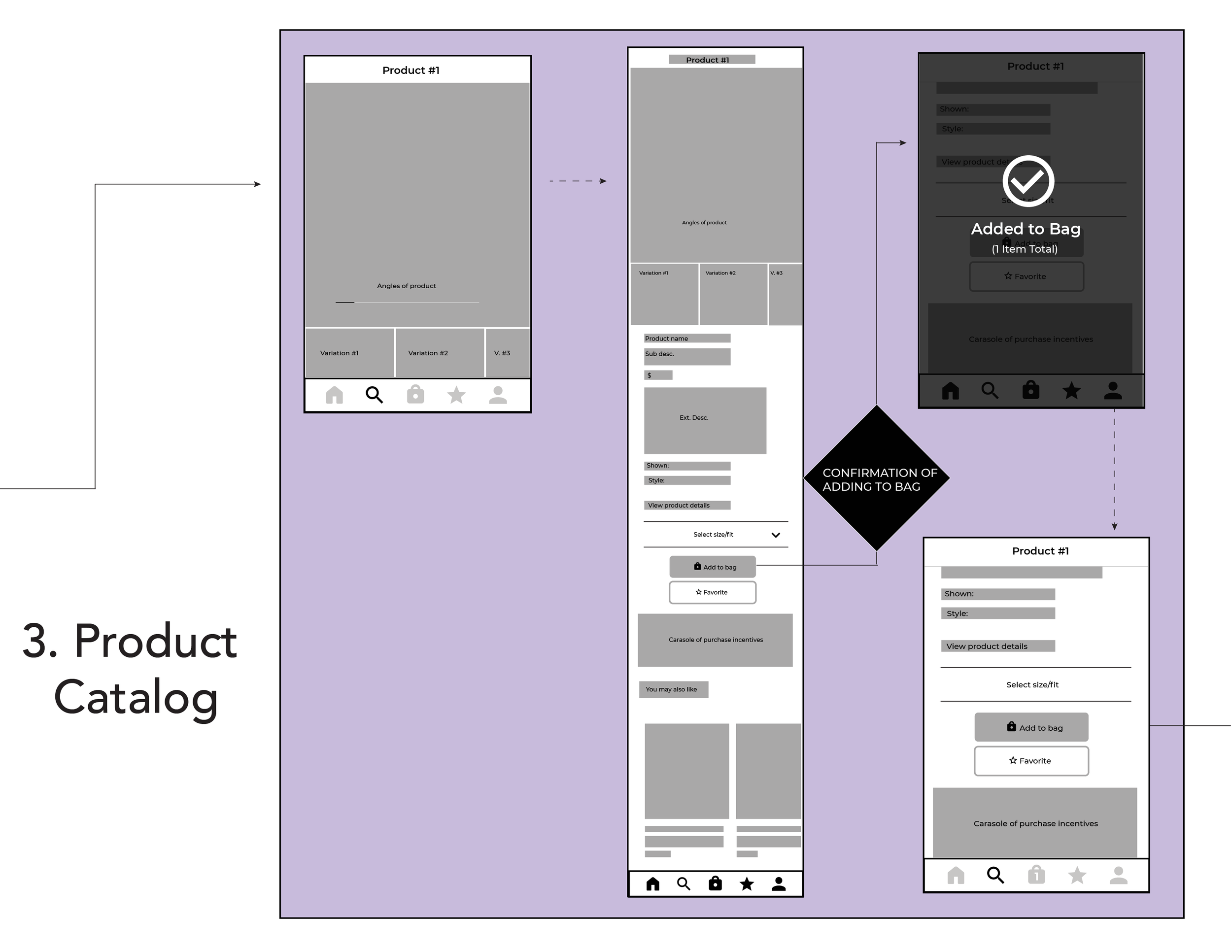
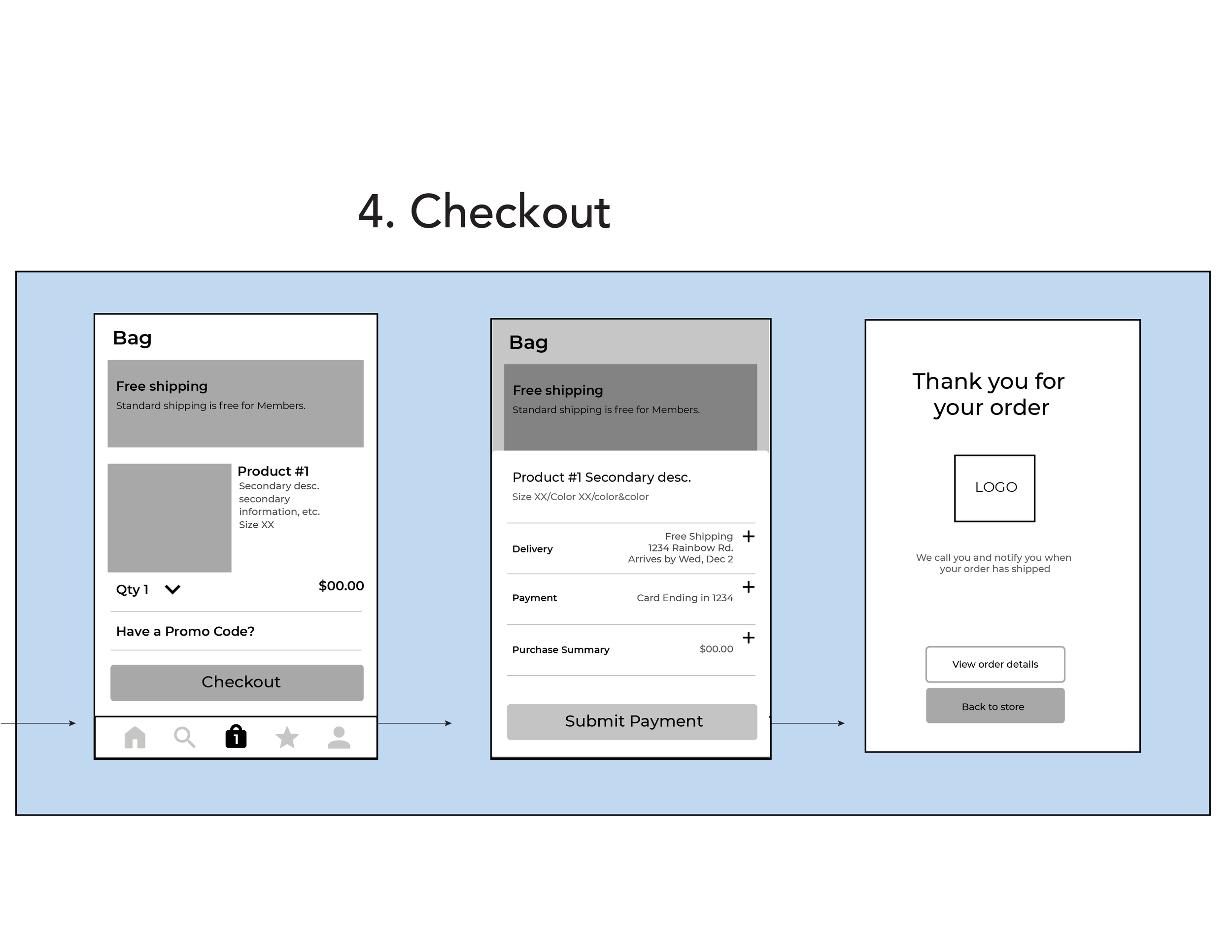
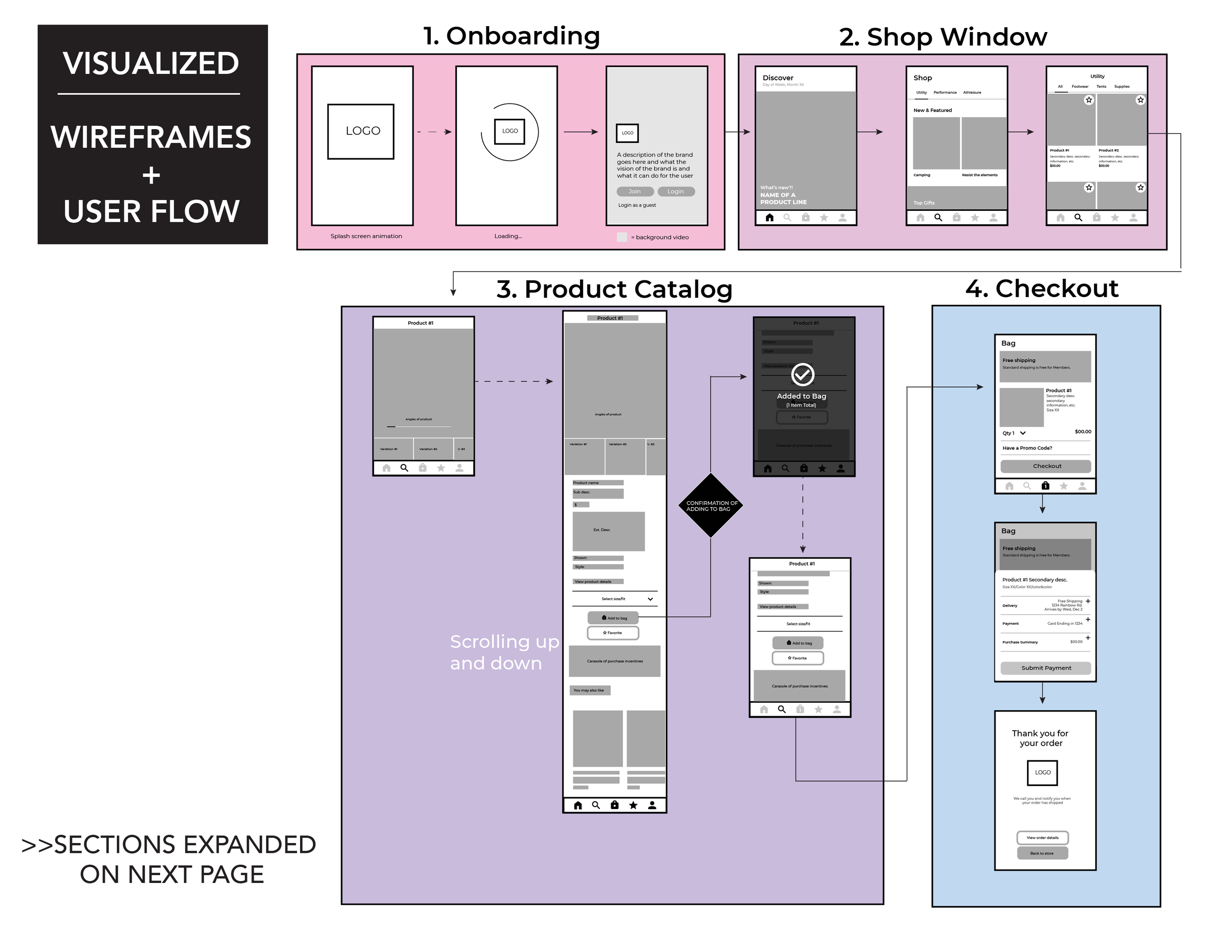
Flow Diagrams were designed to determine the information architecture of the site and organized based on what screens are encountered based on each phase of the sales funnel.
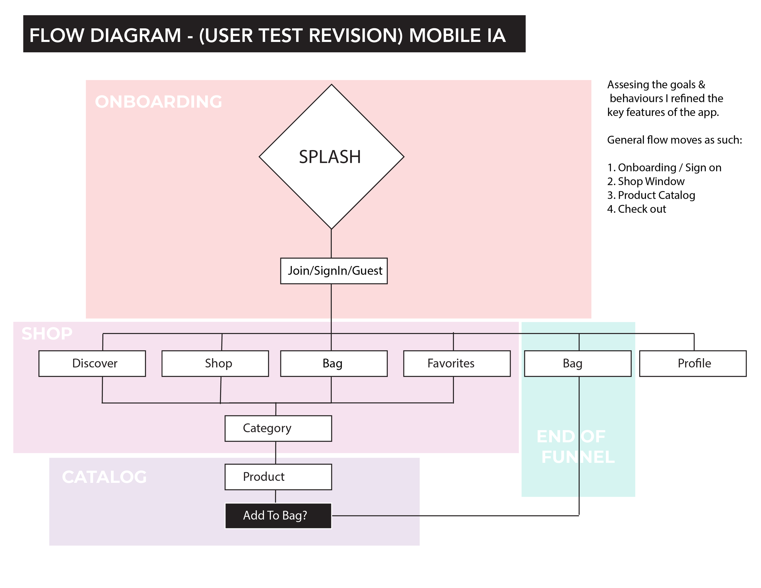
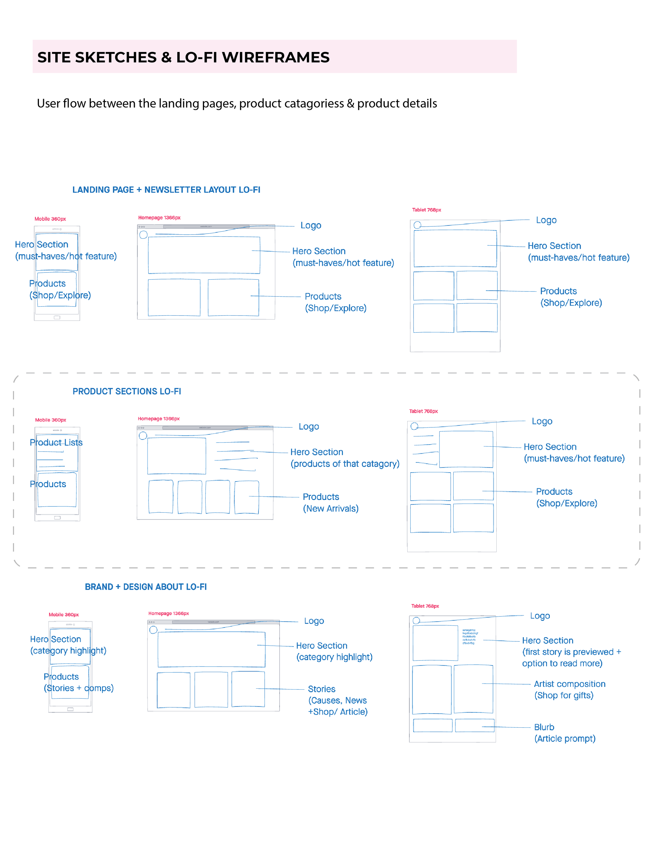
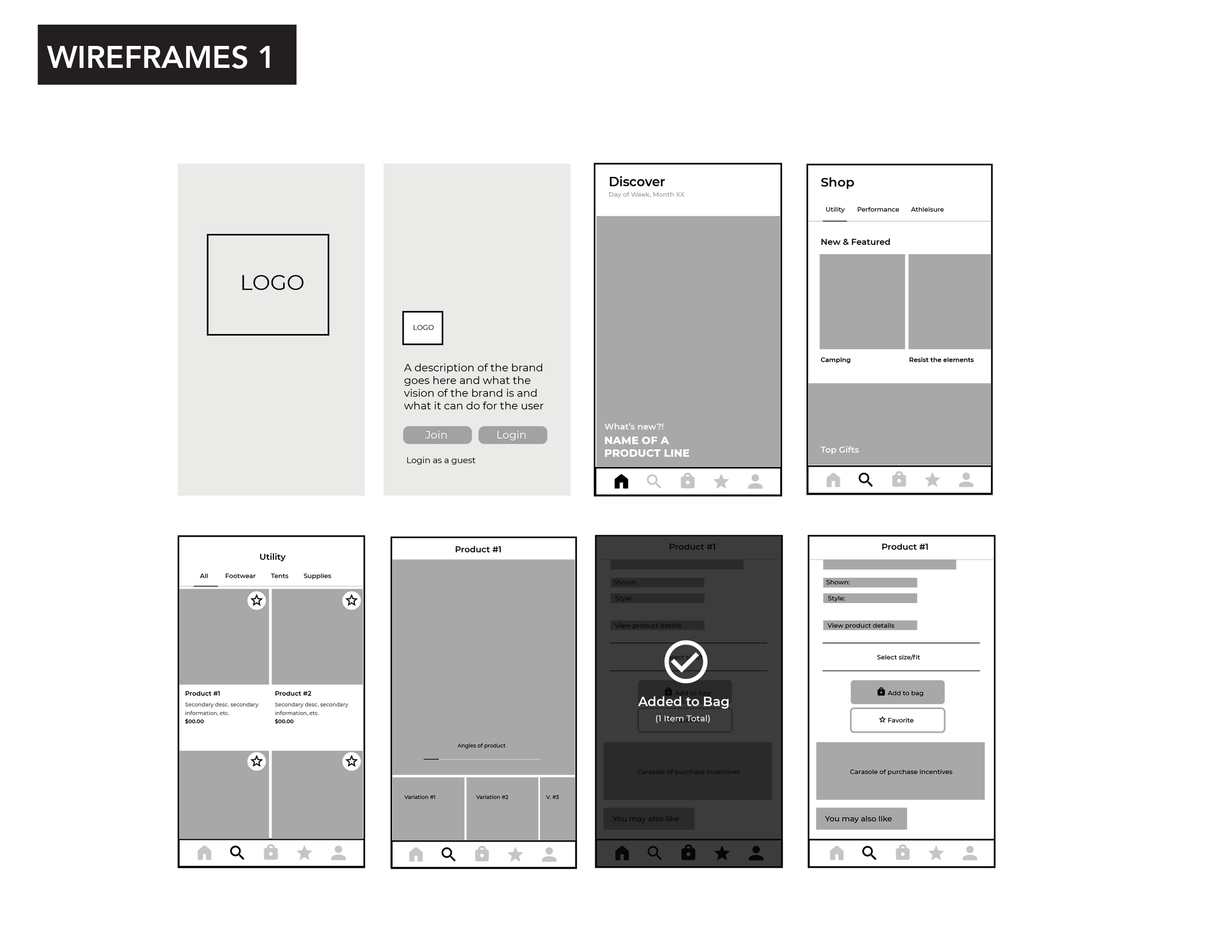
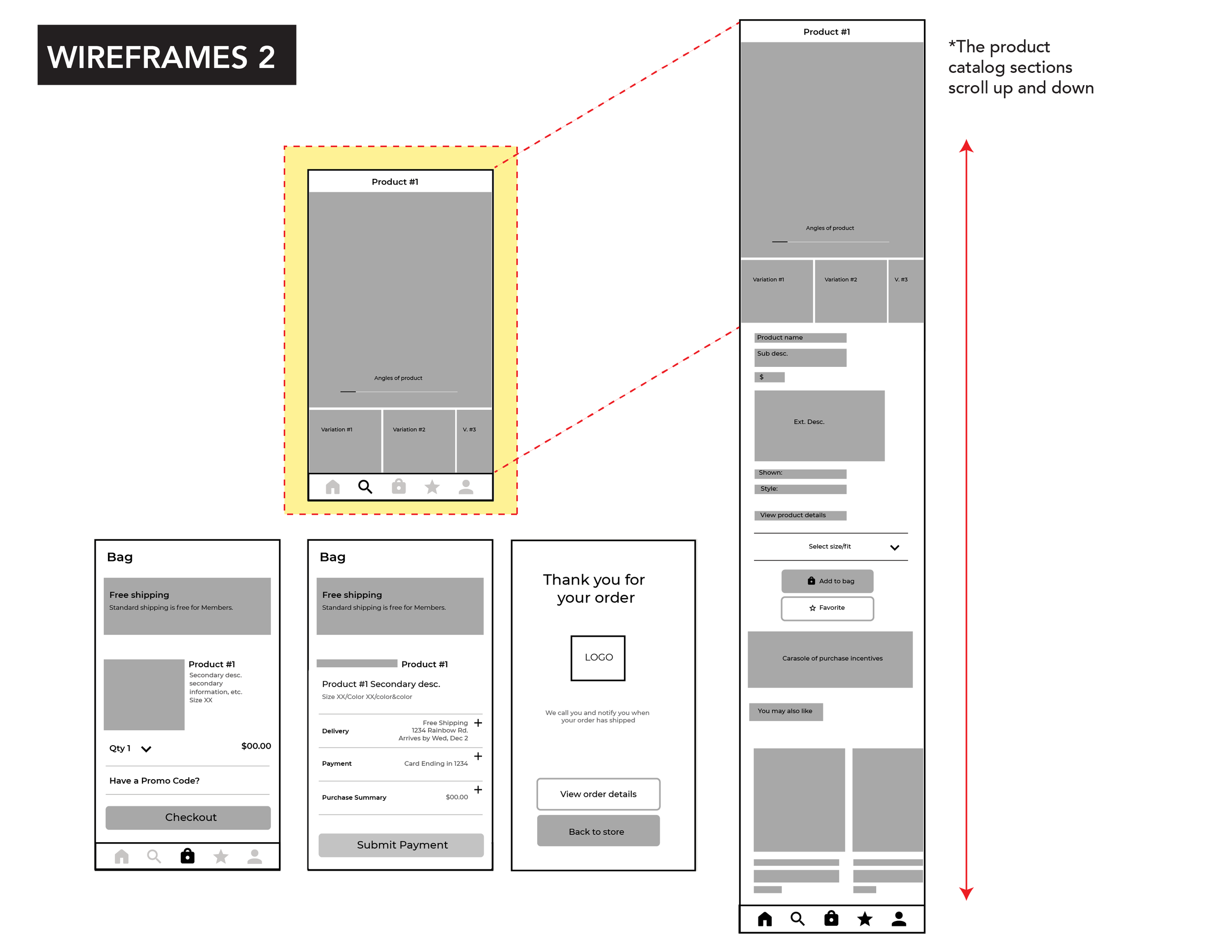
Features, tertiary menus, and overall content hierarchy were sketched, then designed in low-fidelity wireframes to communicate design intention across the funnel in both web and mobile layouts.
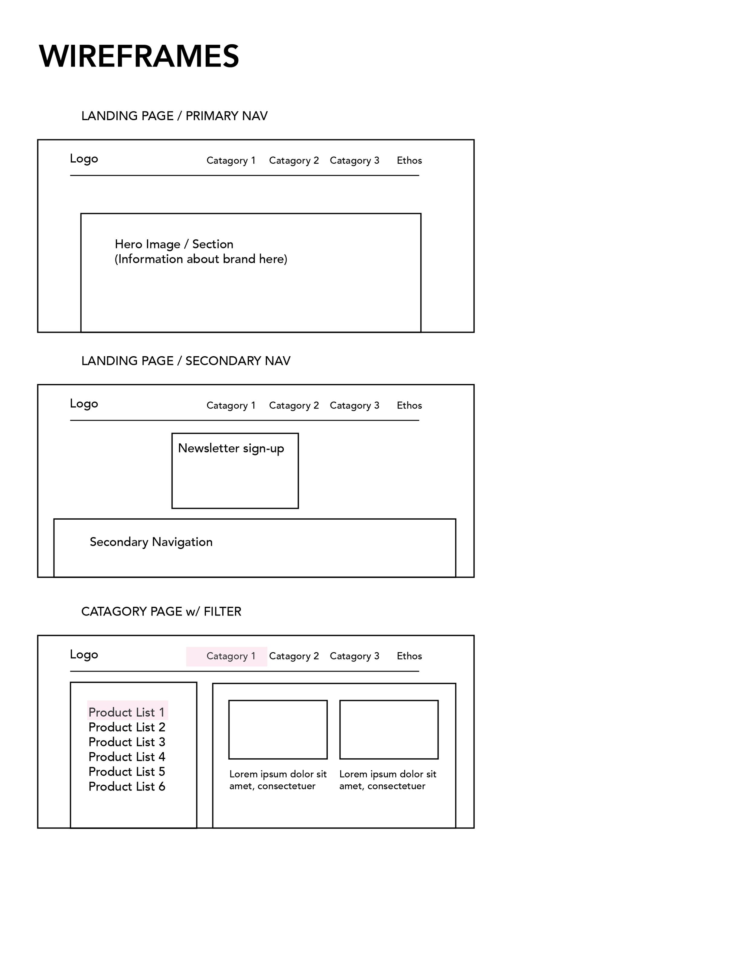
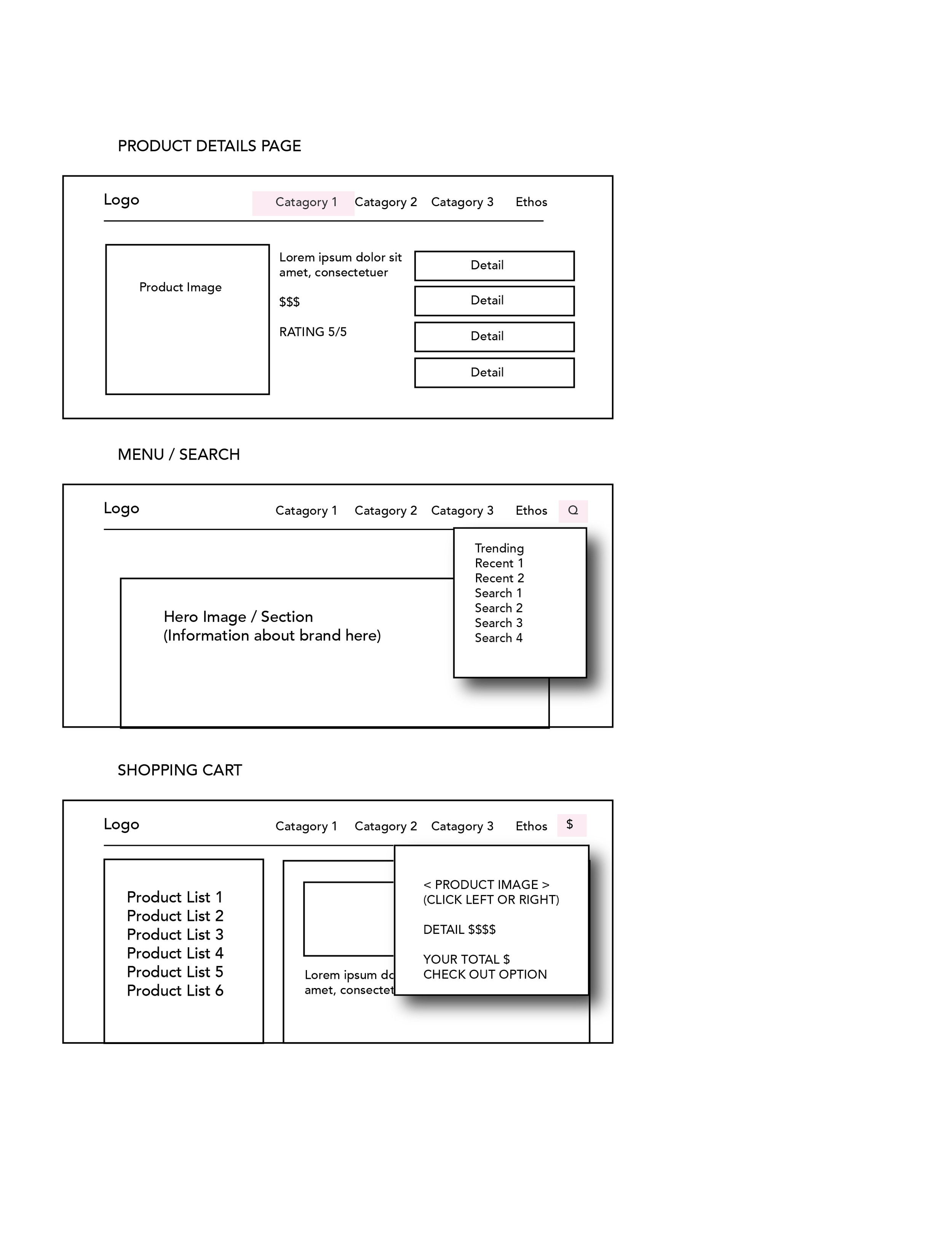
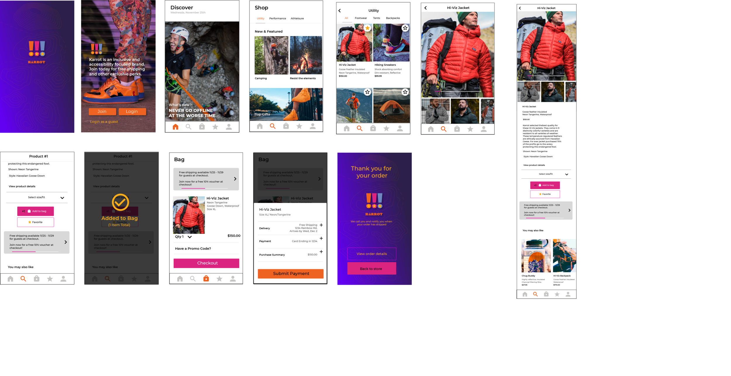
Low-fidelity mockups are mapped to the phases of the sale funnel to visualize the user flow across screens before taking them into high-fidelity screens. At this stage considerations for UI-pattern rules inspired by Material Design Patterns and accessibility with WCAG guidelines are used to determine proper font sizes, spacing, contrast, and other hierarchical considerations.
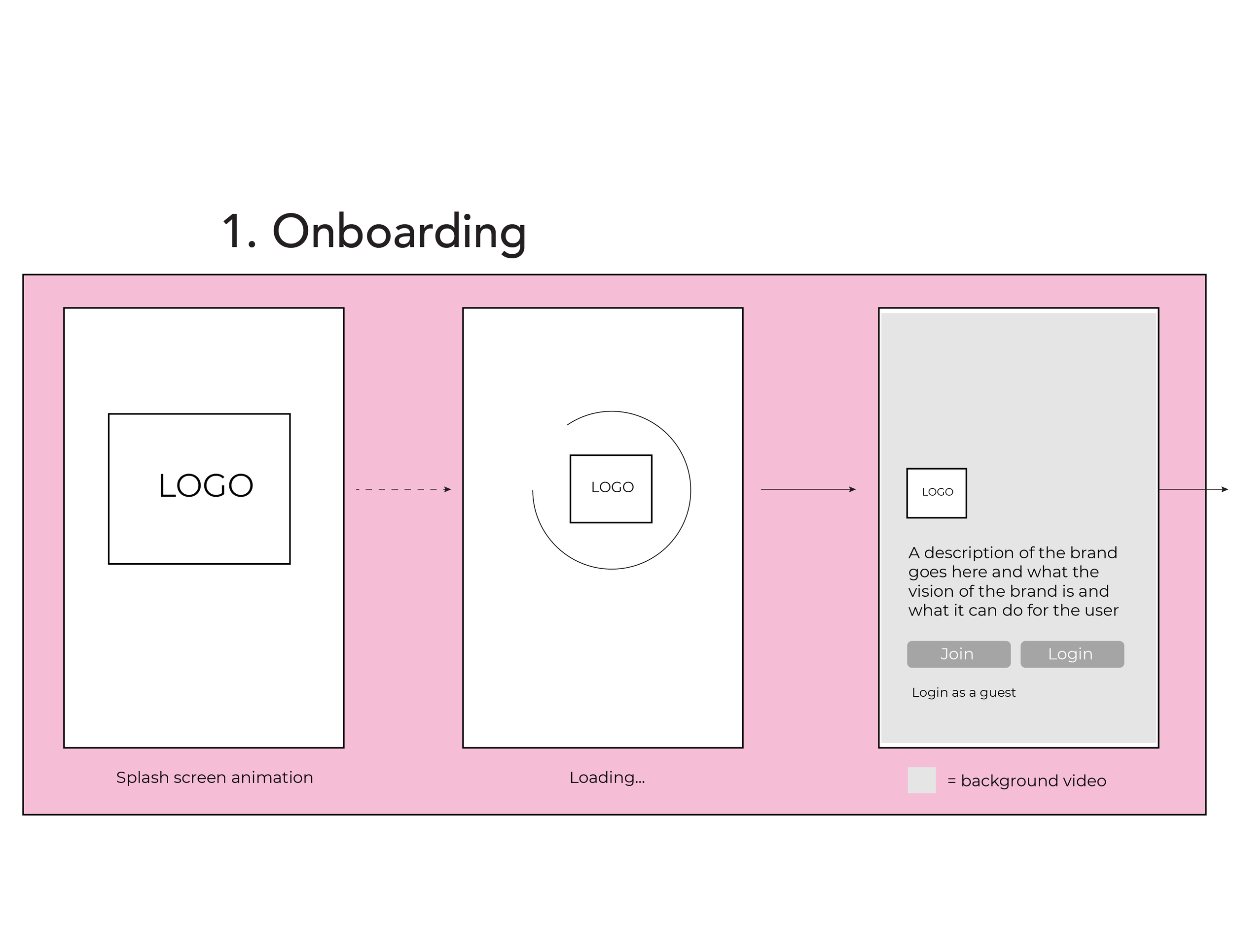
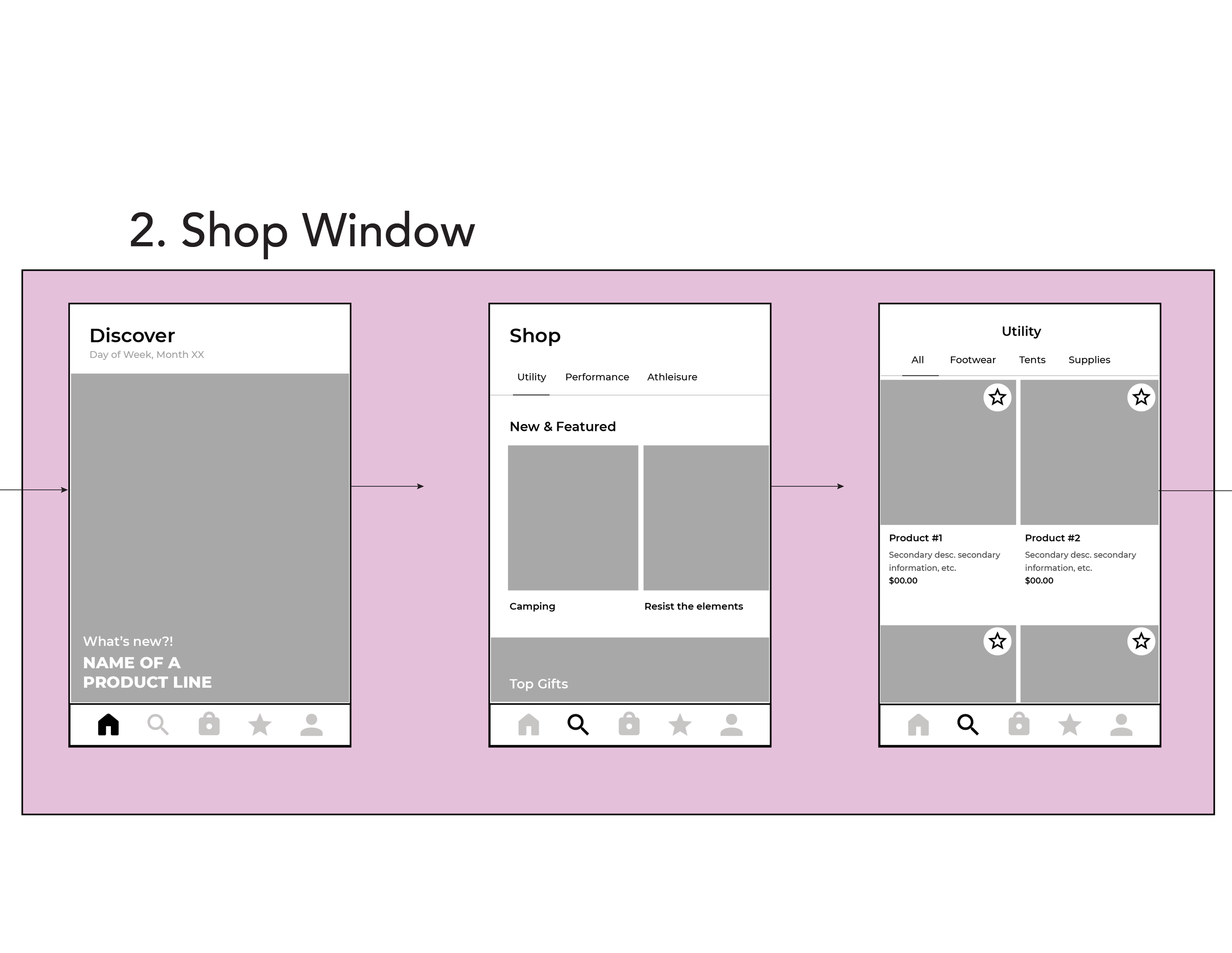
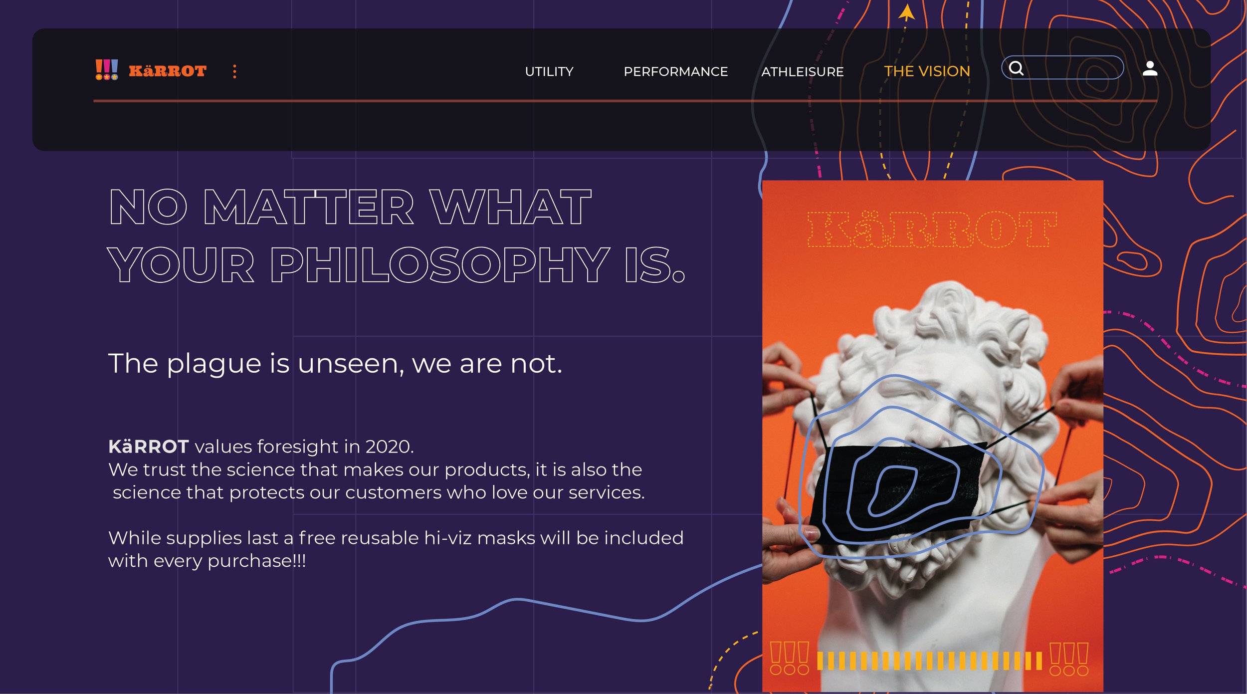
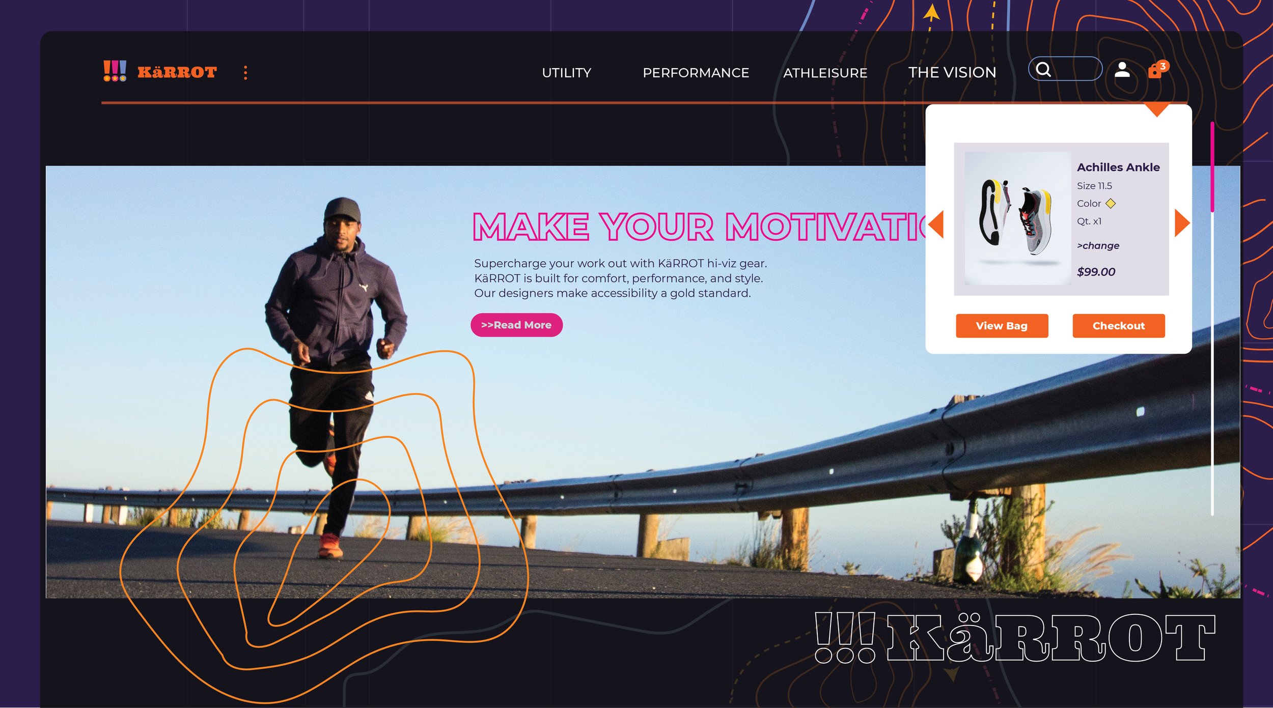
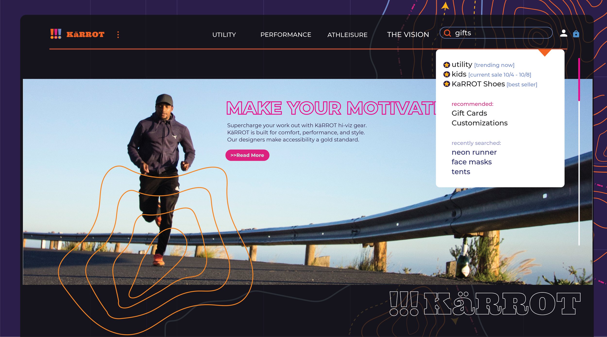
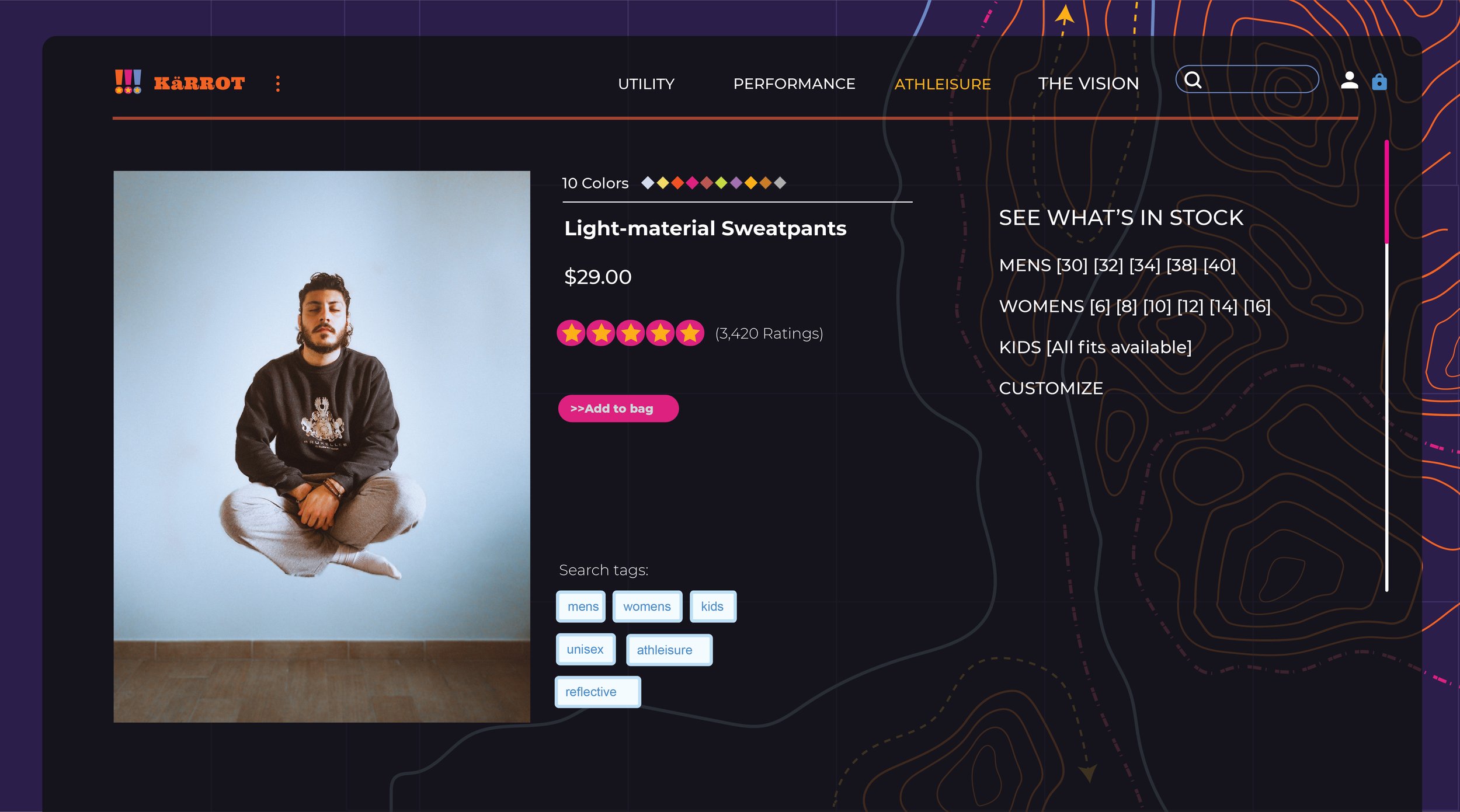
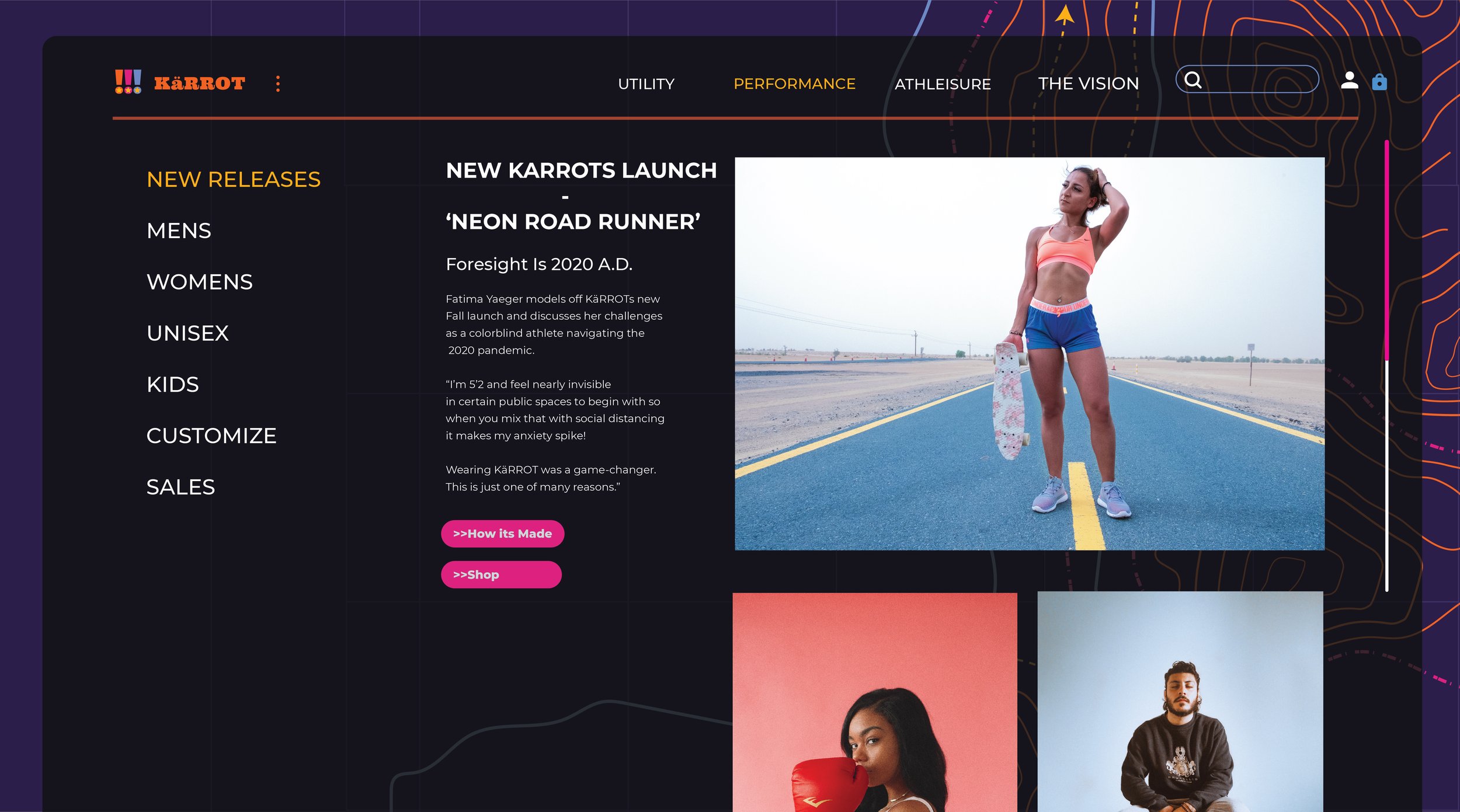
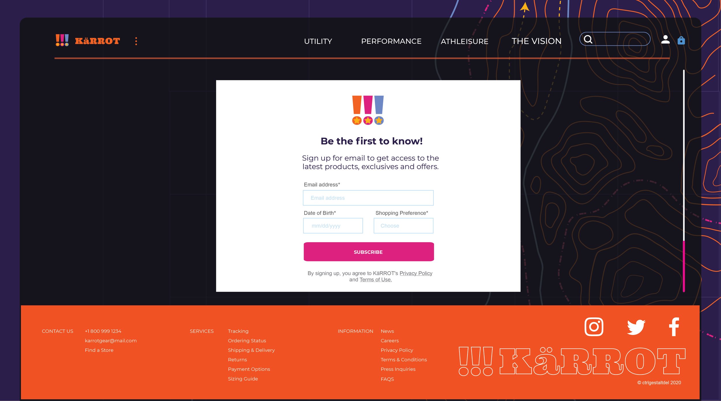
Final high-fidelity screens integrating the company branding and assets and UI patterns from the Material Design System.

RESULTS
Marketing and user research were used to effectively narrow the embodiment of the UI and tested across 10 users who effectively navigated with an average of 4-6 clicks.
Interface patterns comply to WCAG guidelines and intergrate system of branding while remaining consistent and usable.